Glimmer Technology Inc.Storyhunter
Role: UI/UX Designer
Tools: Adobe XD, Photoshop
Product Overview
Storyhunter is a network market place in the digital media industry. It connects media companies, brands and agencies with 42,000+ professional freelancers around the globe. Storyhunter helps to match the perfect creator, or production team, for any creative project, whether it's branded content, local news, or social media campaigns.
Problem
Three years into Storyhunter’s operation, I was brought on as the UI/UX designer to build out the Product team. At that point, the product was built using libraries without any design input. Due to a bare bone design process, this resulted in inconsistent UI elements, failing accessibility, and some really incomprehensible user interactions.
Solution
To ensure consistent UI elements, one of the first things I did was to collaborate closely with the developers to establish a style guide. I then worked with other team members to create a clear design process to incorporate user feedback, design testing, and quality control, especially for accessibility and responsive design.
Keeping it Consistent
One of my first initiatives when I joined the Product team was to work with the developers to create a design style guide and a components library. This helped the product feel more cohesive and intuitive, since the previous mishmash of different web templates and component libraries made the UI inconsistent and the UX confusing.
Left: Above: Examples of the style guide that was implemented. It details two different form fields—the single line text field, and the dropdown menu select.
Design Process
Together with the Product Manager, we outlined an initial design process, which was later refined over time. The process was meant to help us avoid some of the glaring pitfalls in our design decision making. It also helped us to get into an agile cadence that allowed for a quicker and more efficient turn-around of projects.
Customer Feedback
The first thing we established were the processes for gathering customer feedback. This allowed us to understand customer pain points, as well as new features to be added to the product. We broke it down to three different methods of feedback gathering.
Customer interviews
Feature surveys
Behavior monitoring: we were able to observe cursor movements in order to deduce a pattern of user behavior.
Wireframe & Design Testing
Once we understood the problem we were solving for, I would break them down to the basic interactions and turn them into wireframes. These were then tested for viability internally. Sometimes, A/B testing was also done to decide between two directions that seemed equally viable.
Developer Collaboration
Throughout the design process, the developers were intimately involved with our decision making. We always confirm development viability, as well as taking into account any new perspective or feedback.
Design HandoffA handoff meeting is held with the developers once the designs were finalized. This allows any questions or concerns to be raised. It is usually a quick process as the developers have been involved from the start.
Quality ControlOnce development is complete, the Product team would test the features with the QA team to ensure the UI/UX functioned as intended.
Above: An example of a set of wireframes created during the design process. This was for the revamp of the project creation and management feature.
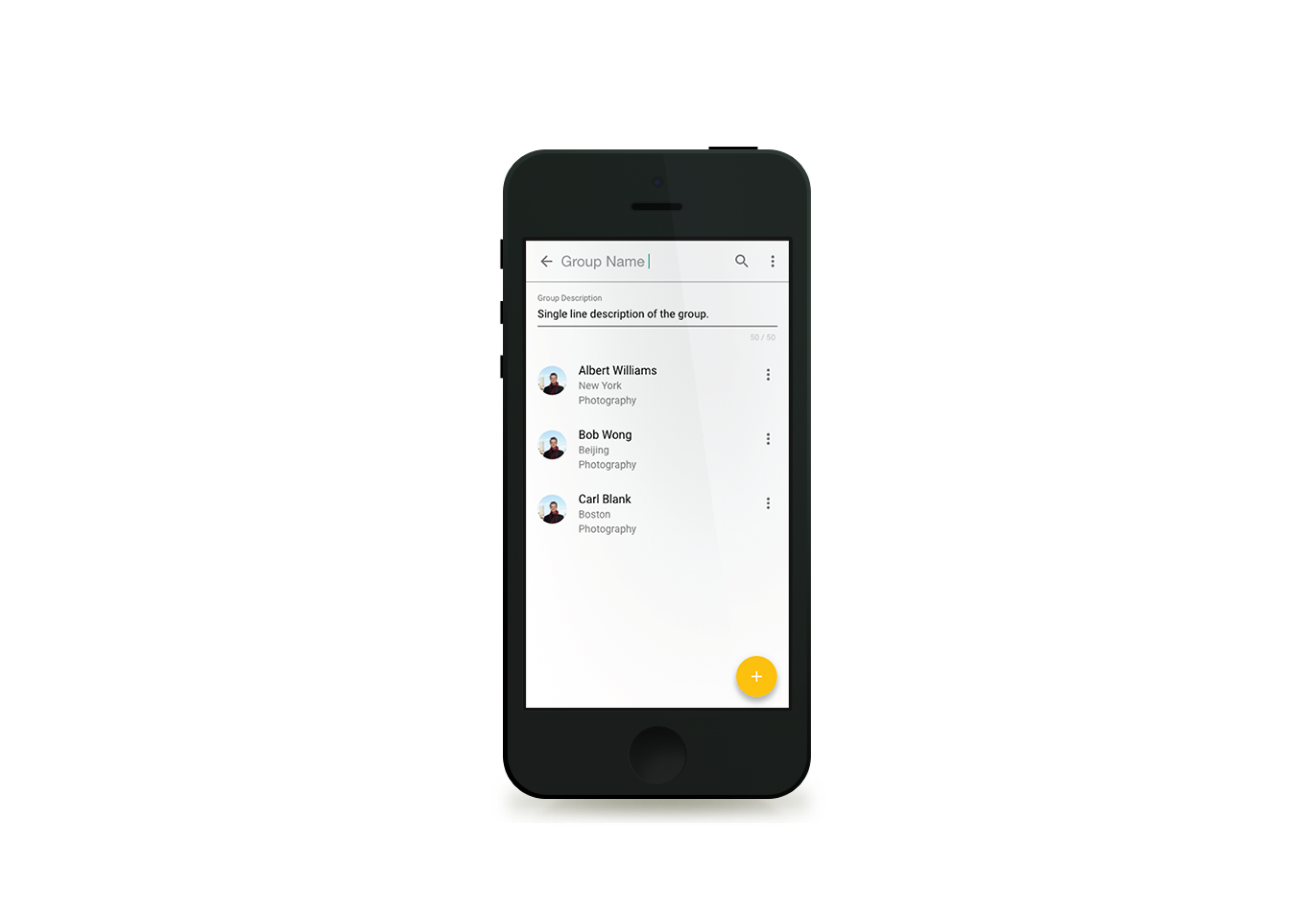
Network & Groups
One of the major user pain points was the inability to manage and organize their contacts within their network. The few organization functionalities that were available also were not very intuitive. To remedy this, Network & Groups, a new feature was introduced. We conducted user interviews to understand the main functionalities being requested. We also re-organized some of the existing functionalities to increase discoverability.
Left: Above: The new feature was broken down to the basic functionalities. Wireframes were created to illustrate each functionality, and allow visual testing for intuitiveness.
Above: The new Network and Groups feature. It was designed with mobile first responsive design in mind, as the app needs to be accessible on both the phone and the desktop.
Below: Examples of finished designs.
User Profile
The user profile was updated with a cleaner look that allowed easier browsing of projects on different screen sizes. Several new features were also added: Endorsements, Reviews and a new ratings system.
Left: Above: The new user profile on different devices.
Below: Examples of finished designs.
Message Center
Storyhunter lacked a central place for users to communicate with others. Messages were decentralized and attached to different projects. This made revisiting messages and discoverability very difficult. The Message Center was conceived to address these issues. It not only acts as a central place for communication, but also acts as a portal for users to manage their projects quickly as they collaborate with others.
Above: The new Message Center on different devices.
Below: Examples of finished designs.
Final Thoughts
The proper design process has the power to bring about a significant UI/UX improvement in a product that was once inconsistent and unintuitive. By following a systematic approach to gather feedback, the product team was able to identify the pain points and areas of confusion for users. Through the iterative process of research, prototyping, and testing, we were able to refine the product's interface, making it more consistent, intuitive, and user-friendly. Ultimately, we were able to create a more enjoyable and efficient user experience, enhancing the overall usability and satisfaction of the product.


